Which Fonts and Colours to Use
In this segment we will look at the importance of type fonts and web colours and what they say about your overall brand.
There are so many fonts out there it can be tricky to know which ones to use – I’ll break down which font styles to use for a certain feel and give you examples of what the big players are using.
We’ll also look at brand colours and how to choose the right colour palette for your brand and the psychology behind it.
Font Styles
- Serif Fonts
Serif fonts are a classy font that are used by the NY Times and Vogue Magazine to name a few, if you look closely this font has little tails at the end which gives it that elegant feel.
Serif fonts feel very timeless and stylish that give a trendy and formal feel and are traditional like Times New Roman.
If you want to communicate to your audience that:
- you’re here to stay and aren’t going anywhere
- they can trust you no matter what
- your product/service is worth the reassuringly high prices that you charge
then a serif font will probably be a good primary brand font for you.
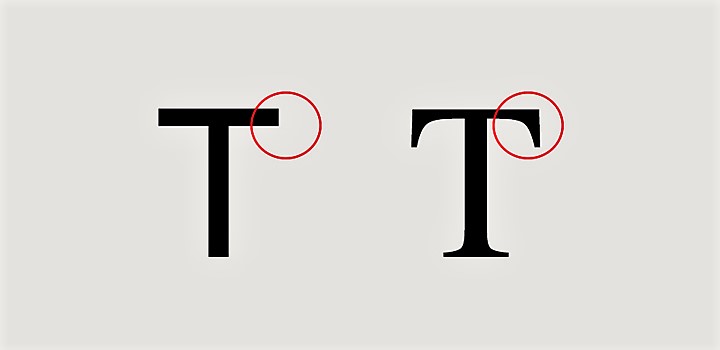
The flat sans-serif compared to the tails of a serif font.
Sans Serif Fonts
These fonts don’t have the little pointy tails on the end and you’ll see this font online quite a bit and because they’re a popular chocie they feel more modern.
A common sans serif font is Arial.
These fonts are very versatile and give a more casual youthful vibe as they can combine well with expressive fonts to give them more balance.
Script/Handwritten Fonts
Script fonts like the style Instagram uses for its logo are used for a more casual, welcoming feel, they can be seen to be more feminine but it’s not always that way – if you compare a graffiti style script it will give you a much different emotion than a script font you would find on a love letter.
Script fonts can be quite loud psychologically so should be used sparingly, also because they can be hard to read you probably would not use this font as part of you main body text or longer headlines.
Scripts would be suited to give the website/brand some additional flair and a distinctive flavour and interest.
Decorative Fonts
These fonts are a bit of a speciality and are the weirder/quirky style fonts.
They can have a modern feel, they can look old like the ‘Old West’ some fonts will have flowers or patterns drawn within the font itself.
These fonts you would use very sparingly, but they can be a great way to inject some personality into your brand or website.
Be careful though as these can very quickly go out of fashion and leave your site looking dated.
Decorative fonts will work well advertising a specific product or a certain campaign.
Font Styles
Most fonts will have numerous styles that can be applied to them which will each give a different feel.
Using a bold style will feel very strong and sturdy where as a skinny airy font will feel dainty, modern and light.
Font styles that are pushed together and squashed will feel frantic and high energy whereas fonts that have spacing between each letter will feel more luxurious with a relaxed confident feel, because of all that space and breath between them.
Using all caps fonts can feel loud and shouty but can make headlines feel strong and assertive and depending on which font you use can look very clean.
Using only lowercase text in a headline or logo has a casual feel, it’s playful and unexpected because you’re not following the typical rules.
6 Fonts You Can Use Forever
Garamond
This font is a classic old style serif particularly used for book printing and body text – if you need your text to look smart then look no further than Garamond.
Bodoni
This font is one of the most elegant fonts ever created – it is used by so many publications (ELLE, BAZAAR, VOGUE) all have used this font to give that sexy, premium, elegant style.
If this is the style you need then check out the Bodoni font family.
Century Expanded
If you are looking for a super easy readable font then this is the one for you – highly popular in books and magazines to keep the reader on the page.
Perfect for Ebooks, large blog posts which is going to be easy for the reader to concentrate on.
Futura
A firm favourite with designers the Futura font is symmetrical, rational and used by some top brands including:
- Redbull
- Omega
- Gillette
- D&G
- Calvin Klein
- Luis Vuitton
- NIKE
Super easy and versatile so definitely check out Futura font family on your next project.

Times New Roman
The default font used by Microsoft since forever – so everyone has used this font at some point, because of that everyone recognises it and it gives a safe feeling, and trustworthiness to it so it shouldn’t be disregarded.
It’s very versatile and is great in books and body content as it is an easy readable font.
Helvetica
A lot like Futura this has been used by some extremely big brands, super clean, super versatile, and is an iconic font.
Created in Switzerland which was the epitome of elegance it was quickly seen on advertisements in the 1960s and 1970s across Europe and USA – it is now used within big brands marketing and branding.
- BMW
- American Airlines
- LG
- The North Face
- Toyota
- Nestle
- Kawasaki
- Lufthansa
I would highly recommend that you install ALL these fonts onto your system so you have access to these classic fonts.
As my business is going to be aimed at a more luxurious market I have found these possible fonts to work with for any future products, and possible website fonts:
Playfair Display: This elegant and luxurious serif font has a high-end feel, making it suitable for luxury and upscale designs. It also maintains a sense of calm and approachability, making it a versatile choice.
Montserrat: This font is a modern and friendly sans-serif typeface. It has a luxurious touch but still manages to appear friendly and approachable, making it suitable for various design purposes.
Lato: Lato is another versatile and friendly sans-serif font that can add a touch of sophistication to your design while maintaining a sense of calm and approachability.
Cormorant Garamond: This font combines elements of classic elegance with a contemporary touch. It’s a high-contrast serif font that exudes luxury while maintaining a calm and inviting appearance.
Source Sans Pro: Source Sans Pro is a clean and modern sans-serif font. It has a professional and high-end look while remaining friendly and legible.
Poppins: Poppins is a sans-serif font with a modern and sleek design. It can add a touch of luxury and sophistication to your design while remaining friendly and inviting.
Roboto Slab: This serif font is a more contemporary option, combining a sense of luxury with a touch of friendliness and approachability.
- Abadi: This font was used in my free giveaway travel ebook – I just like this font and have used it in other projects, so thought I would include it for you.
Brand Colours
Creating a brand colour palette can seem a bit overwhelming but it shouldn’t be, and I will show you how to go about creating your brand colour palette in next to no time.
The first issue we have is colour psychology – what do colours tell us about a certain brand or product.
Red = Excitement (Virgin)
Purple = Royalty (Hallmark)
Blue = Trust (Samsung)


Tiffany and Co. have used the same blue tone since the beginning of their existence, so their customers know that brand.


So why do we want a branded colour scheme?
- Helps you stand out in the marketplace.
- Encourages customers to perceive your brand in a certain way.
- Helps you become more memorable as a brand over time.
Dominant and Accent Colours
You want to choose 5 colours for your brand – yes 5!
This will include 2 dominant colours and 3 Accent colours
Dominant Colours.
- Your first colour is your primary colour and the one you will be remembered by
- Your second choice is a complimentary colour and should simply look good besides your Primary colour
Accent Colours.
- The first accent colour is what’s called a highlighter this colour stands out and creates a contrast when used beside both dominant colours.
- The second and third accent colours are both base colours and should be more neutral allowing your two dominant colours and one accent colour to do most of the work.
Creating Your Colour Palette
Watch me create a colour palette for my web business ‘Seas of Solitude’ then you can create one for your brand.
Although my business is aimed at a luxury market I opted not to use the colour Purple which is associated with luxury brands – I just thought for what I want the website to look like the Steel Pink colour suited my branding much better – my point being although colours have meaning, they are just a guide so don’t feel forced to use a certain colour just because the psychology says you should.
My advice to you is to create multiple colour palettes in coolor.co print them off or save them to your phone, then come back to them a few days later – ask your friends which they like better or even post on social media and ask people for advice.
Does this mean I can’t use the colour Purple now in any of my branding?
Of course not – I’ll want to stay on brand as much as possible to keep the authenticity of the brand alive but if I was making a future ebook and after trying different book colours and asking people what they thought and making the executive decison myself found that Purple (for what ever reason) was the clear favourite – then obvisously I will want to use it – hope this helps!
Happy Designing! 🙂
Conclusion:
I hope you found this page informative and not too much like being back at school – but I feel it’s really important to understand what your customers are drawn too and how we can influence their decisions with font styles and colour choices.
Remember have fun with it – stay on brand but don’t be afraid to go rouge.
In the next lesson we will use our colour palette to design a fresh looking business logo.
See you there!